Bonjour,
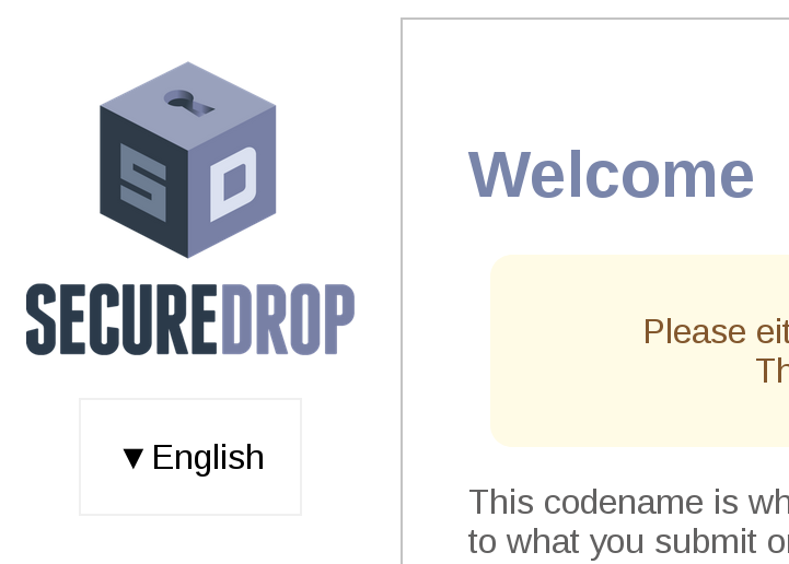
The Apache.be SecureDrop landing page was recently translated and all translations are on the same page. This is good because it preserves the Landing Page Best Practices. But it could probably be improved from a UX perspective, maybe with a CSS based language menu similar to what we have for the source interface ?
Any ideas ?